When it comes to marketing products, it’s better to spoon-feed subscribers than leave them to their own devices. If the content’s good, but it doesn’t guide a reader to taking action, you’ll struggle to succeed. Using a CTA in your campaigns can improve conversion rates and your marketing ROI.
You can improve your click-through rates by 127% with a button-based CTA.
Source: Campaign Monitor
What are CTAs and how many can an email have?
Marketers want their subscribers to take action after reading the content of an email, and a CTA gives the reader a clear action to take during or after scanning content. CTAs come in all shapes and sizes and use a specific phrase to lead a consumer to take additional action.
You can incorporate a CTA into the text copy of marketing material, add one as a button at the bottom of an email, or provide multiple CTAs for different content blocks. This means how and when you choose to use a CTA should depend on your content. When to use more or less entirely depends on your marketing campaign.
Source: Mention
CTAs work on every marketing channel or platform. They are common on websites, in social media posts and pages, or as part of your email marketing campaigns. For the best results, you should follow the best practices when designing or writing your CTAs.
Best practices for CTAs in email marketing campaigns
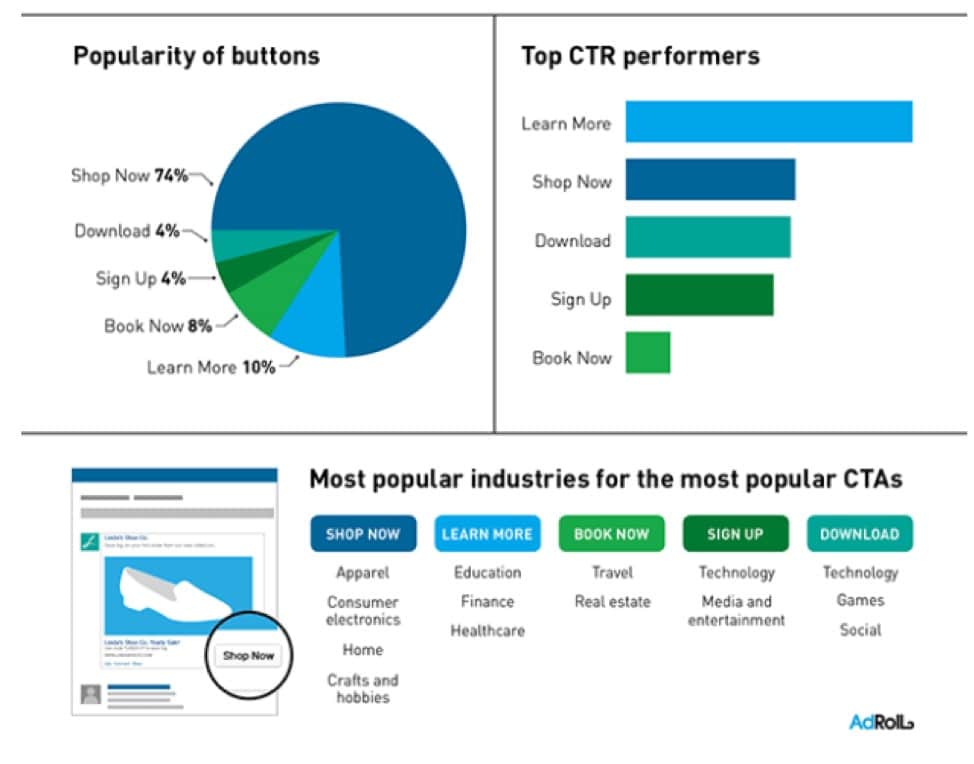
Before writing or designing your CTA, it’s important to know what you expect the reader to do. If you’re promoting a sale, you’ll want them to go to your shop and make a purchase. This will require you to include a “Shop Now” button that takes the subscriber to the specials page.
The key is to understand what the reader’s intent would be after opening the email. For newsletters and events, you can add a “Find Out More” button. Whatever the reason, make sure subscribers know they’re taking action in response to the content that they just read.
Tips for creating CTAs that drive up conversion rates include:
- Using actionable language and phrases.
- Designing the button to be easily identifiable.
- Keeping CTAs short without losing the context of the required action.
- Changing the Point of View (POV) to address readers directly.
- Trying to create a sense of urgency.
What to avoid when creating CTAs
To avoid creating CTAs that don’t have the desired effect, you should never overwhelm a reader with too many options. For emails that have a list of products, you can add CTAs to different sections, as long as each CTA is relevant to its accompanying item.
Additional don’ts for adding CTAs to your emails are:
- Making the button or link difficult to find in the content.
- Using the wrong language that doesn’t apply to your message.
- Asking subscribers to sign up for services that you didn’t explain in the content.
- Using toned-down colors that don’t pop or inspire actions.
- Not designing CTAs to display properly on mobile devices.
How to measure the success of your CTAs
You can track how well your CTAs perform using click-through rates. If you’ve applied the above tips to your campaigns, you should note an uptick in how many readers click on the button and visit your site or page. To measure the success clearly, you can try different CTAs (changes in phrases and colors) in different campaigns to find the most effective strategy.
Does it really matter?
Making the effort to perfect your CTAs can increase your conversion rates exponentially. While the content may grab a reader’s attention, if they don’t know what action you want them to take, it could be a wasted opportunity.
What now?
A well-executed CTA depends on the type of content and what actions you want subscribers to take. You can add more CTA buttons to an email if the content requires them, but be sure not to overwhelm subscribers by placing them frivolously throughout the content.
