Article first published in November 2015, updated June 2019
What makes an email work? It isn’t one thing that convinces subscribers to open your email or click on a call to action; it’s a combination of things. But, first, why choose email in the first place? In 2019, isn’t social media the place to be?
The answer to that is a hard no—and here’s why.
What are some advantages of email?
Social media is a great place to be when it comes to the daily interactions between you and your audience. However, did you know that 61% of consumers actually prefer to be contacted by their favorite brands through email, not through social media?
When it comes down to receiving promotional content and other marketing materials, 72% of people prefer to receive it through email, not through their social media channels. Also, in terms of overall return on investment (ROI), marketers see an average 4400% ROI and $44 for every dollar spent.
This is why email is still the king of content, so it’s wise for your marketing team to hop on that gravy train, if they haven’t already.
How can I write an effective email?
Like the human body, an effective email relies on a series of high-functioning components to thrive. Any weakness in the system takes a toll on the entire body. It’s the same with your emails. If the subject line is weak or the links are broken, your email can flatline.
To help you write a catchy email that’ll get your subscribers’ blood pumping, we’ll dissect some real-life examples and explain the anatomy of an effective email.
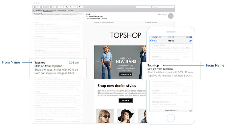
“From” label
The “From” label is the face of your email. Your face makes you easily recognizable, which is exactly what the “From” label does. It tells subscribers who sent the email. Use your company name so the “From” label is professional and instantly recognizable.
Subject line
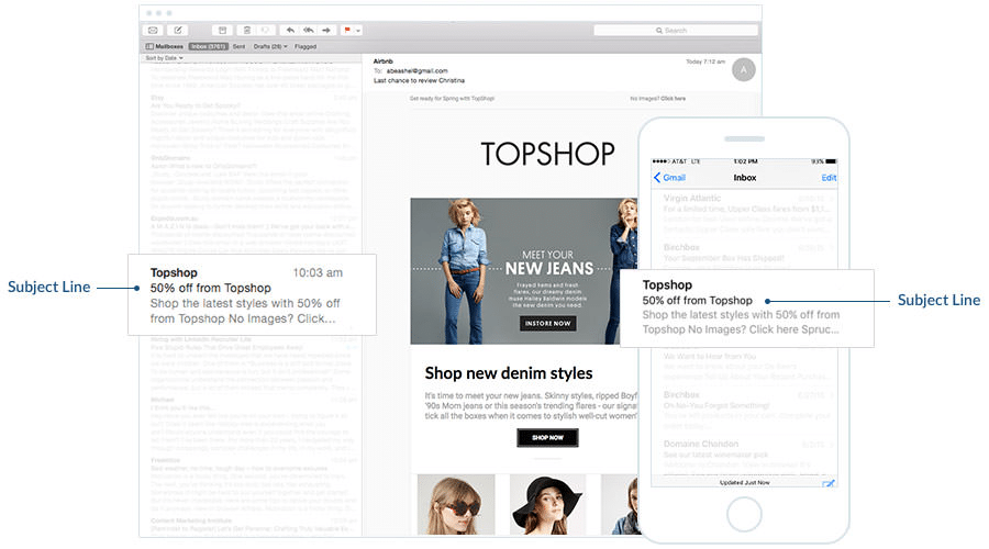
The subject line is the heart of your email. Just like your body can’t function without your heart, your email can’t function without a good subject line.
Like the heart, subject lines have a lot of power. Thirty-three percent of subscribers decide whether or not to read your email based on the subject line alone. That’s a lot of pressure.
How do you write a must-read subject line? Here are some tips:
Keep it short.
Subject lines should be 40-50 characters or 5-6 words.
Describe what’s inside.
Think of a subject line like a newspaper headline. It tells readers what they’re about to read by describing the article in a brief, interesting, and descriptive way. A subject line should do the same.
Use urgent language.
When creating a subject line, use the present tense and create a sense of urgency. Use words that encourage swift action, like “Act now” or “Join today.”
Be creative.
A subject line that’s funny or maybe even a little weird can encourage subscribers to open your email. Don’t be afraid to be creative. Maybe even test out using emoji and see what they do for your open rate.
Preheader
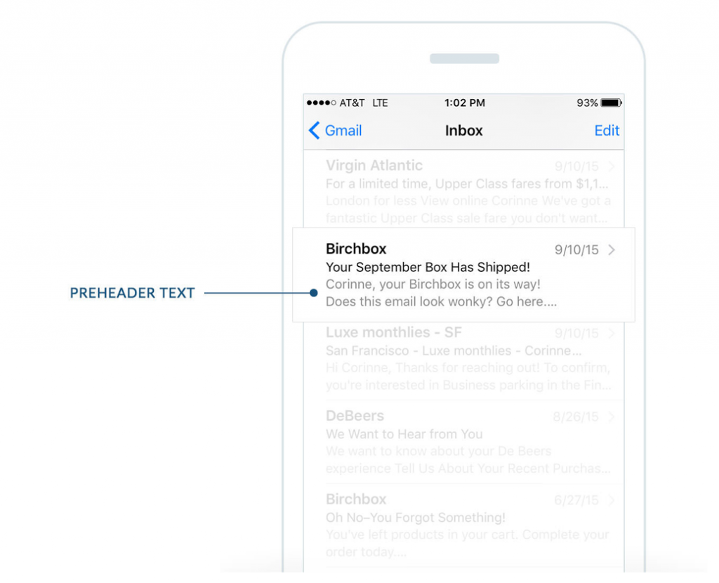
The preheader of an email is like your posterior nares. The what? Most people aren’t sure where or what that is. It’s part of your nose that allows you to breathe. It’s a little-known body part that’s vital to your survival, just like the preheader.
Take a look at the example above. The preheader text follows the subject line in the inbox preview pane. What’s so special about this little snippet of text? It gives subscribers more information about your email message. It’s one of three pieces of information (after the “From” label and subject line) that subscribers use to decide whether or not to open your email. Think of it as the wingman to your subject line, providing an extra bit of context to your subscribers about why they should open your email.
Email copy
The copy of your email is the brains of the operation. The text of an email is responsible for stimulating subscribers to think and act, just like your brain.
The text should be short and to the point. Convey your message quickly. Now isn’t the time for long sentences or super-detailed anecdotes.
If your message contains a list, consider using bullet points to keep everything organized.
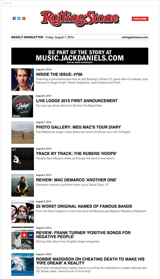
What if you’re sending a newsletter? It’s true that newsletters are supposed to contain a lot of information, but you don’t have to include an entire article in your email. Take a look at the newsletter from Rolling Stone.
Their newsletter gives small snippets of each article with links to read more, rather than putting the entire content in the email.
Consider using different fonts or colors to make certain aspects stand out. In the example above, the headline is in a bigger, bolder font to grab attention.
Links
Remember to add a few links to your email. Hyperlinks represent the arms of an email’s anatomy. Your arms help you explore the world around you, just like links.
There isn’t a magic number of links that you should include in each email. You should do what works for each message. You can link to product pages or a page that answers frequently asked questions. There are a ton of options.
And be sure to always test your links before sending any email to make sure they work properly.
Imagery
What part of the anatomy do images represent? We could say that email images represent your stomach. Your stomach craves food just like subscribers crave visual stimulation.
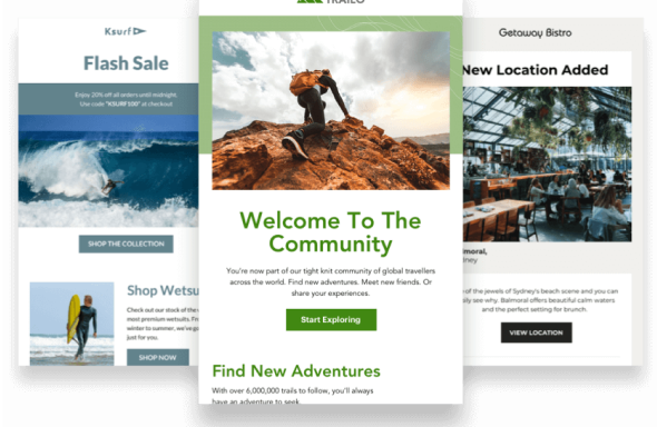
There are two basic types of imagery. You can include an actual picture of a person, place, or thing, or you can include artwork. The examples from Campaign Monitor customers below showcase both.
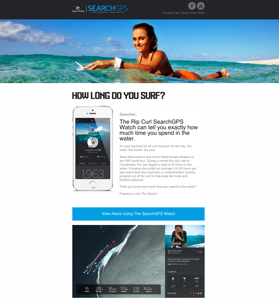
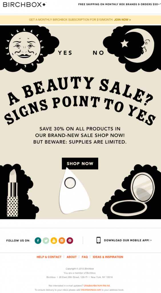
Need help obtaining images? Turn to sites like Death to the Stock Photo, Twenty20, and Stocksy for high-end images without super high-end prices.
Call to action
Every email needs a call to action. It’s an instruction that encourages action. The call to action is like your legs. You need your legs to get from one place to another, right? Well, the call to action should encourage subscribers to go from reading your email to the next stop on the digital journey.
It could lead subscribers to a company website, product page, blog article, or social sites.
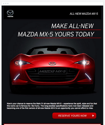
Take a look at this example from Mazda. It’s well done because:
Color selection
The color red, which is used sparingly throughout the email, is visually appealing. It draws a reader’s attention to it.
Button creation
The call-to-action is a button, which also makes it stand out. Consider using a button rather than using hyperlinked text for your call to action.
Social buttons
Your social buttons represent the mouth of your email. After all, social media is all about digital word of mouth.
Make sure every email has links to share your message on social channels and, when appropriate, to follow your business on social media.
Unsubscribe
The unsubscribe option at the end of every email is like your fingernails. Your fingernails require maintenance, just like subscribers do.
Including an unsubscribe button is not only a better user-experience, but it’s also required.
The standard placement for the unsubscribe link is at the bottom of the email. Here’s an example from Global Fund for Women. It explains why the subscriber receives the message and provides a link to unsubscribe.
In addition to your unsubscribe link, consider creating a preference center that allows subscribers to change things like email frequency. It gives subscribers more control over their inbox and could keep them from removing their name from your list altogether.
Examples of effective emails
Ready for a few more real-life examples of effective emails? Here are a couple we came across that we thought were stellar examples of what an email should look like.
WordPress
This email from WordPress caught our attention because it included several of the crucial pieces of information we’ve covered.
First of all, the email subject line instantly captures the reader’s attention by addressing a pain-point that many website owners have—creating shareable content for your website.
They continue to capture the reader’s attention by moving on to the preheader text, where they ask the question that website owners are probably asking themselves: “What type of content gets the most shares?”
Just that alone makes the reader want to open this email because it’s addressing a common pain-point and is more than relevant to the reader.
Source: Gmail
Once we open the email, we get to see that WordPress has checked off each of the essential pieces of an email. Their copy is relevant; they have working, relevant links for readers to click on; and attractive, simple to use call-to-action buttons that lead the reader to pages they’ll find useful. Readers also have the option to click on their social buttons to follow the brand, or they can easily unsubscribe by clicking the link at the bottom.
Source: WordPress
Alaska Airlines
This email example from Alaska Airlines caught our eye for several reasons. First of all, instead of using high-quality stock photos throughout their message, they made use of beautiful artwork—something many email marketing teams avoid because they believe it’s less relatable.
There’s nothing wrong with turning your email into a beautiful piece of art. As long as you’re sticking to a central theme—such as the light, airy feel that Alaska Airlines has accomplished here—then swapping out traditional stock photography for artwork and other imagery is a great idea.
They still tick off every other checkbox on the anatomy list, including catchy headlines, compelling text, a call to action, social buttons, and an unsubscribe option.
Source: Really Good Emails
Wrap up
There’s a reason doctors learn anatomy first. They have to understand how the body works in order to help patients stay healthy. It’s the same with email marketing. By understanding the anatomy of an email, you’ll be able to keep your marketing in tip-top shape and treat any problems that come your way.
You know the bare bones of effective email writing; now it’s time to up the ante by adding personalization into the mix. Check out our 5-step guide to effective email personalization to take your email campaigns to the next level.
