Article first published January 2013, updated March 2019
The decision-making process around where to place links and buttons typically revolves around where they can be seen. However, given the popularity of mobile email clients, perhaps we also need to be considering where they can be tapped.
Ergonomic design in email newsletters and smartphones
Now that a large percentage of us are managing our email using inputs other than a mouse and keyboard, it’s likely time that we considered the ergonomic design in email. Luke Wroblewski’s post on responsive navigation got us thinking that the same concerns with link placement, as it relates to adaptive design, apply to email as they do the web.
Can’t touch this: the trouble with touchscreens and ergonomic design in email
From a usability point of view, two features that regularly differentiate emails viewed on touch devices from those opened by the keyboard-and-mouse set are:
- Viewport dimensions that are often on the small side (i.e., phones)
- Buttons, links, and content are not as easy to use on touch screens as they are on other displays
If you browse your email on a mobile device, you’ve likely come across email newsletters that are near-impossible to read and navigate. In most cases, it’s a matter of a wide layout or a lot of content forcing the mobile email client to zoom out to fit it all on a small screen. This also results in content and links that are too small to be usable. As Luke’s post mentions:
“…while big touch targets can be comfortably used with a mouse, small mouse size targets can’t be used easily with touch.” ‘Responsive Navigation: Optimizing for Touch Across Devices‘, Luke Wroblewski
Then there’s the smartphone ergonomic design factor. Unlike screens that can be quickly manipulated using a mouse’s wide range of motion, touch interfaces tend to be more or less usable, depending on the posture you assume (eg. thumb typing, using the device with the hand you’re holding it with, or resting it on a table). Wroblewski says:
“These common patterns of posture create easy to hit and hard to reach touch areas. The area toward the bottom of the screen is easy, whereas the upper corners are a bit of stretch”.‘Responsive Navigation: Optimizing for Touch Across Devices‘, Luke Wroblewski

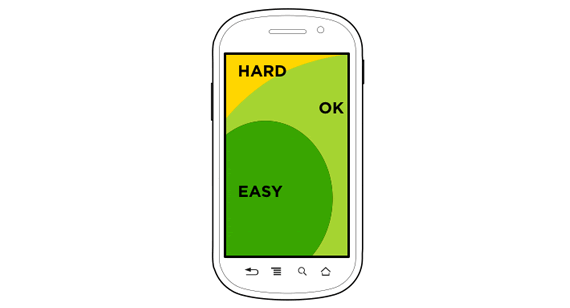
Pictured above is Luke’s diagram of what are considered to be Hard, OK, and Easy touch areas on a mobile device, when used by a right-handed person in a variety of postures. If, on opening an email, your primary call to action is in an “OK” or “Hard” area, could this have implications for your response rates?
Putting ergonomic design in email into practice
Now, it would be silly to radically alter a perfectly good email layout based on this touch area hypothesis alone. However, as we covered in a previous blog post on email usability, aligning your content to the left does already have a proven advantage: being seen. To recap:
“…readers of left-to-right languages (like English) are accustomed to scanning from the top-left first. Keep this in mind when designing two- or more column layouts.”‘Email usability: The science of keeping it short and sweet‘, Campaign Monitor
This scanning-from-the-left behavior continues as a reader scrolls down a screen, which means links placed in the “Easy” zone are optimal for both reading and tapping.
In the “Design techniques” section of our Guide to Responsive Email Design, we make a couple of additional recommendations regarding touch target size and placement, so we highly recommend giving this a read if you’re interested in making the most of your links.
How to create mobile-friendly buttons that sync with the ergonomics of smartphones
When considering ergonomic design in email, your goal is to improve reader experience. You want to make it easy for subscribers to read, understand, and engage with your email. Read on to discover how to design mobile-friendly CTA buttons that sync with the physical (and mental) ergonomics of smartphones.
1. Place the button where it’s easiest for readers to click.
According to Luke’s smartphone ergonomic design research, the best place for your button is in the bottom-left quadrant of your email campaign. You could also get away with centering the CTA button.
Consider using heat maps to track where your readers click and engage with your email. See any hot spots? That might be a good place for your CTA button.
2. Pay attention to your typography hierarchy.
Your subscribers don’t read every word; They scan. As they scan, they expect your font weights and sizes to display some kind of hierarchy.
In regard to CTA buttons, this means you need to make sure the colors and font you use stand out from that of your headings and body copy. Using a delicate font and colors that blend into your surrounding text won’t give your CTA button that extra element it needs to grab attention.
This email from Glitch uses a bold font for the CTA button and the color stands in stark contrast to the rest of the design.
Source: Really Good Emails
3. Be careful with images.
You can certainly use images themselves as CTA buttons. Plenty of brands create beautiful flyer-style emails where the images include CTA links.
There’s one problem: your subscribers might not realize they’re clickable. According to research from Nielsen-Norman Group, it’s important to include some kind of text or signifier in your emails (especially flyer-style emails) that makes it obvious what’s clickable.
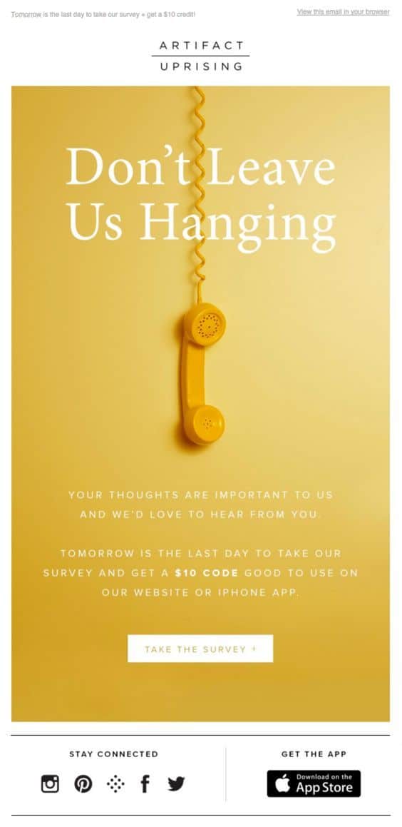
This email from Artifact Uprising uses a flyer-style template but clearly differentiates between what’s clickable and what’s not. It also honestly states what’s on the other side of the button link.
Source: Pinterest
4. Clearly and honestly declare what the button links to.
We often hear the phrase “Don’t make any promises you can’t keep” when discussing email subject lines. It doesn’t come up enough, however, when talking about CTA buttons and links.
As you can imagine, Nielsen-Norman Group found that readers get extremely frustrated when a CTA button says “Get Started” but instead takes them to a convoluted landing page, survey, or sales funnel.
Use your email copy to clearly and honestly state what users will get by clicking the button. Make sure your landing page matches up to the description without taking the reader through unnecessary steps.
Wrap up
The ergonomics of smartphones aren’t the first things marketers think about when they design email campaigns—nor should they be—but you’d be foolish not to give ergonomic design in email at least some consideration. The bottom line is that ergonomics put user experience first. When you design your campaign around your users’ actual behavior instead of how you think or wish they’d behave, it’s a lot easier to encourage them to take action.
We’d like to hear your take on this idea. Should we consider the ergonomics of smartphones when designing newsletters? Do you struggle to navigate emails because links are out of reach? How could this affect your response rates? Let us know in the comments below.
Our customizable email templates make it easy to create engaging campaigns with CTA buttons that look amazing on any device.


